Have you ever wondered how billions of connected devices manage to communicate and make sense of all the data they generate? This is where data visualisation in IoT comes into play. How about trying to interpret thousands of sensor readings, machine health metrics, or GPS data without a clear visual representation? No need to say that it would be nearly impossible to make fast, accurate decisions! Data visualisation helps turn raw, complex information into something people can easily understand and act on. Whether it is monitoring smart cities, improving healthcare, or optimising complex industrial processes, visualising data enhances how businesses and individuals interact with IoT systems.
In this article, you will learn how IoT data visualisation transforms raw sensor data into actionable insights, enhancing efficiency, monitoring, and decision-making.
In this article, you will learn how IoT data visualisation transforms raw sensor data into actionable insights, enhancing efficiency, monitoring, and decision-making.
We will know
- Real-Time Monitoring
- Quick Decision-Making
- Detecting Anomalies and Predicting Failures
- Enhancing Operational Efficiency
- Improving User Experience in IoT Applications
- Key Data Visualisation Techniques for IoT
3. Employing IoT-Driven Data Visualisation for Better Visibility in Industrial Projects
Understanding Data Visualisation in IoT
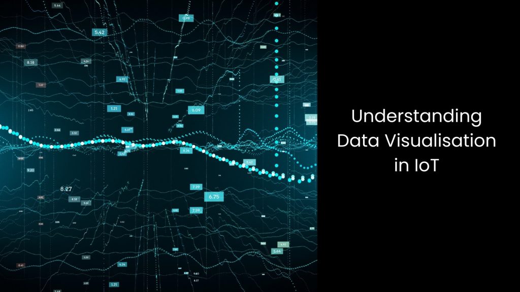
- You may know that IoT devices constantly collect massive amounts of information from sensors, GPS trackers, and machines, generating real-time data on temperature, movement, energy use, and more.
- This endless stream of numbers means nothing unless turned into something people can easily understand. So, what is IoT Data Visualisation?
- It transforms raw data into clear visuals like charts, graphs, and dashboards, helping businesses make better decisions without drowning in spreadsheets. Traditional methods may struggle to do this as IoT data comes fast, in different formats, and from multiple sources, making manual analysis slow and overwhelming.
- As mentioned before, turning raw numbers into visuals allows industries like smart cities, healthcare, and manufacturing to track traffic, monitor patient vitals, and prevent machine failures before they happen. You see, a single temperature reading might not say much, but a heatmap showing rising temperatures across a facility instantly signals a problem.
- Therefore, it is certain that without data visualisation, businesses would miss patterns that could save time, money, and resources.
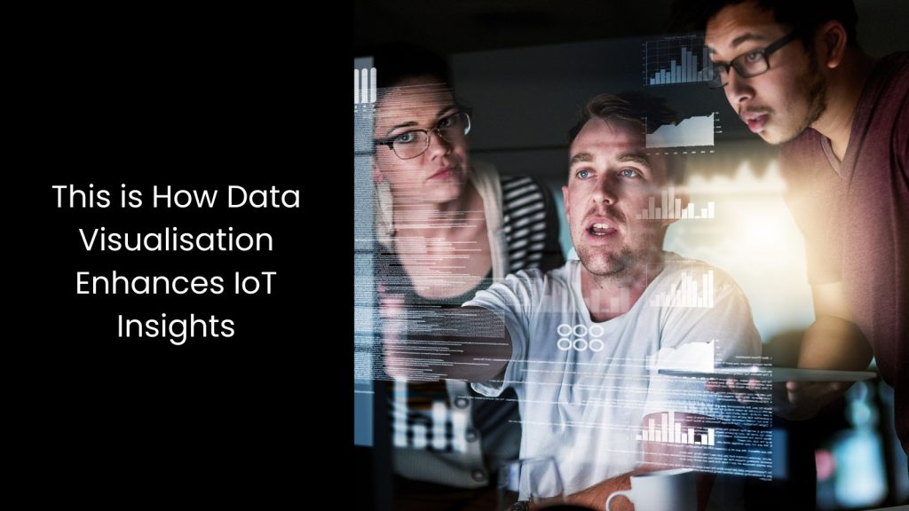
This is How Data Visualisation Enhances IoT Insights
Real-Time Monitoring
Businesses that use IoT devices deal with an unstoppable stream of information from sensors, GPS trackers, and machines, making it tough to catch important details in time. This is where data visualisation steps in, turning endless numbers into clear visuals that highlight trends, patterns, and problems as they happen.
IoT analytics relies on real-time charts, graphs, and dashboards to help businesses monitor systems instantly, avoiding delays that come with manual data processing. Instead of waiting hours or days to find out something went wrong, companies get real-time IoT insights, allowing them to react before small issues turn into major failures.
A factory, for example, can track machine temperatures and spot overheating the moment it happens, preventing breakdowns and expensive repairs. In smart cities, traffic management systems use real-time heatmaps to adjust signals, reducing congestion without human intervention. Hospitals rely on IoT-connected devices to track patient vitals, alerting doctors immediately if something changes.
Without visualisation, all this data remains a chaotic mess, making it impossible to spot problems quickly.
Quick Decision-Making
The industrial world that relies on IoT devices deals with massive amounts of real-time data, but numbers alone do not help when quick decisions matter. Big data visualisation turns endless streams of raw information into clear charts, graphs, and dashboards, helping decision-makers understand patterns instantly.
Instead of sifting through spreadsheets, teams get a visual snapshot of what is happening, allowing them to react without wasting time. A manufacturing plant, for example, can track machine performance in real-time and spot unusual activity before it leads to costly breakdowns. Without visual insights, businesses risk slow reactions, missed opportunities, and costly errors.
Seeing data in an organised, visual format makes decision-making smoother, helping industries act faster and avoid disruptions.
Detecting Anomalies and Predicting Failures
We know that IoT devices constantly gather data from sensors tracking temperature, pressure, vibrations, and other factors. But the problem is that raw numbers do not always show when something is about to go wrong.
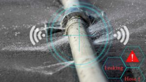
This is where sensor data visualisation turns those complex readings into easy-to-understand graphs, charts, and heatmaps, helping businesses spot unusual patterns before they turn into serious failures. Instead of waiting for a machine to break down, real-time visuals highlight warning signs like sudden temperature spikes, irregular energy usage, or unexpected drops in performance.
An industrial plant, for example, can use sensor data visualisation to detect early signs of motor failure, allowing maintenance teams to fix the issue before production stops. In aviation, airlines track engine performance, spotting subtle shifts that signal potential failures long before they cause flight delays. Smart cities rely on visualised air quality data to detect pollution spikes, helping authorities respond faster.
Without this level of visualisation, businesses might overlook early warning signs buried in endless data streams. Seeing these anomalies clearly allows companies to act early, prevent downtime, and reduce repair costs.
Enhancing Operational Efficiency
Companies handling IoT data know that efficiency means everything, but making sense of endless raw numbers can slow them down. That is why the question ‘What is data visualisation in IoT?’ has become one of the most searched ones on Google.
This indicates that the latter transforms complex data into real-time visuals, helping businesses streamline operations without wasting time. Instead of digging through spreadsheets, teams use dashboards to track performance, detect inefficiencies, and optimise workflows instantly.
In water and wastewater industries, real-time visualisations highlight bottlenecks in treatment procedures, allowing managers to adjust schedules, reduce waste, and improve speed. When it comes to the construction realm, smart buildings rely on IoT analytics to track energy usage, adjusting lighting and climate control based on real-time occupancy, cutting down on unnecessary power consumption.
Seeing performance insights in an easy-to-read format makes optimising operations faster, smoother, and more effective.
Improving User Experience in IoT Applications
It is not a secret that industrialists expect IoT applications to be smooth, fast, and easy to use, but dealing with raw data makes that nearly impossible.
This is when an IoT dashboard steps in, turning complex numbers into clear visuals that help users interact with devices effortlessly. Smart home apps, for example, use real-time graphs to show energy usage, helping users adjust appliances to save power without digging through confusing reports. Wearable health devices track heart rates and activity levels, displaying trends in simple charts instead of overwhelming people with endless numbers.
Businesses rely on IoT analytics to improve app interfaces, ensuring users get instant insights without struggling to understand technical data. Otherwise, IoT apps feel cluttered and frustrating, making users lose interest.
When data appears in an easy-to-read format, people make better decisions, interact with devices efficiently, and enjoy a smoother experience.
Key Data Visualisation Techniques for IoT
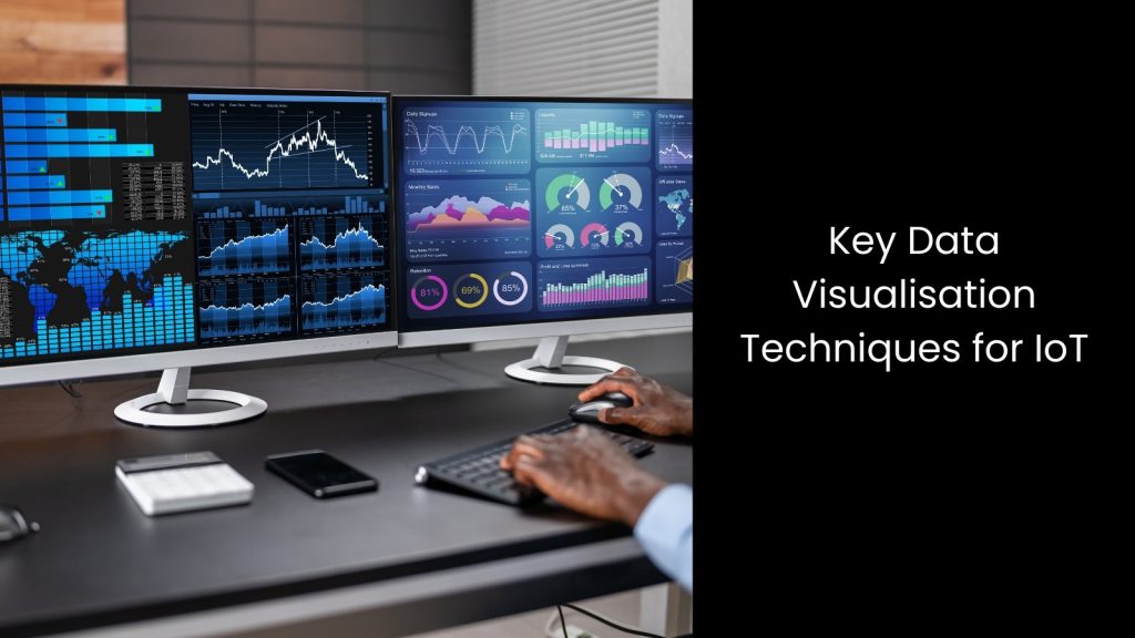
In the below section, let us look into the main types of data visualisation techniques for IoT in the industrial world.
- Dashboards: These tools provide real-time monitoring of IoT data through an interactive user interface, allowing quick decision-making.
- Heatmaps: Heatmaps visualise data intensity to highlight areas with high activity or frequent failures in an IoT system.
- Geospatial Mapping: It tracks the movement and location of IoT devices, helping manage logistics and fleet management.
- Time-Series Graphs: These are the ones that show how IoT data trends evolve over time, helping track performance and detect anomalies.
- Network Graphs: Network graphs represent connections between IoT devices, helping analyse communication patterns and identify potential issues in the system.
Employing IoT-Driven Data Visualisation for Better Visibility in Industrial Projects
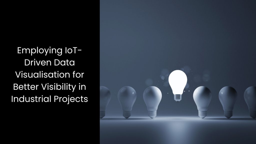
Did you feel the power of visualisation? As you can see, when industrial projects grow more complex, IoT-driven data visualisation becomes a true game-changer. When you purchase the right IoT Data Visualisation embedded software solutions from a reputed supplier, it allows project managers to see real-time insights, spot potential issues early, and make informed decisions that boost productivity. What else is more important than visibility in industrial projects?