
Did you know that nearly 85% of project managers report that visual tools significantly improve communication and decision-making in development projects? Australia is a country where complex infrastructure and IT development projects are progressing day by day. Using network diagrams for data visualisation has become a critical strategy in such projects. These diagrams provide a clear and detailed visual representation of connections, dependencies, and workflows, making it easier to manage large-scale projects.
In this article, we discover how a Network Diagram enhances Data Visualisation in Australia.
We will uncover
Why is Data Visualisation Important?
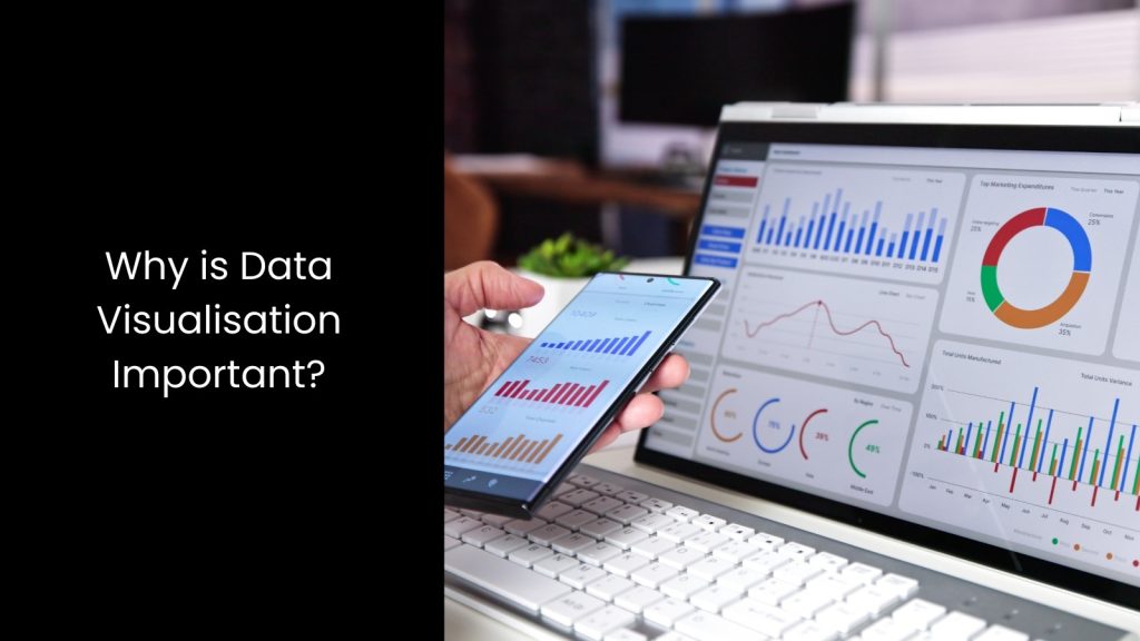
- Data visualisation has become a main aspect of any project as it transforms complex data into clear, visual formats, making information easier to understand and analyse. It helps project teams quickly grasp key insights from the data, allowing them to make informed decisions.
- When development workers work with large amounts of data, visualisation tools simplify the process of interpreting trends, patterns, and outliers that might otherwise go unnoticed. This efficiency saves time and boosts productivity since stakeholders can immediately see what matters most. In one way, Data visualisation also improves communication across project teams and stakeholders as it presents data in a clear and engaging way.
- This is where charts, graphs, and network diagrams make it easier to explain findings, track progress, and discuss results without diving into raw data. Also, this helps identify problems early in the project. When trends or anomalies appear in visual reports, workers can address these issues before they escalate, reducing risks and delays. This visual clarity also supports strategic decision-making, as project managers can use data visualisations to prioritise tasks, allocate resources, and forecast outcomes more accurately.
What is a Network Diagram?
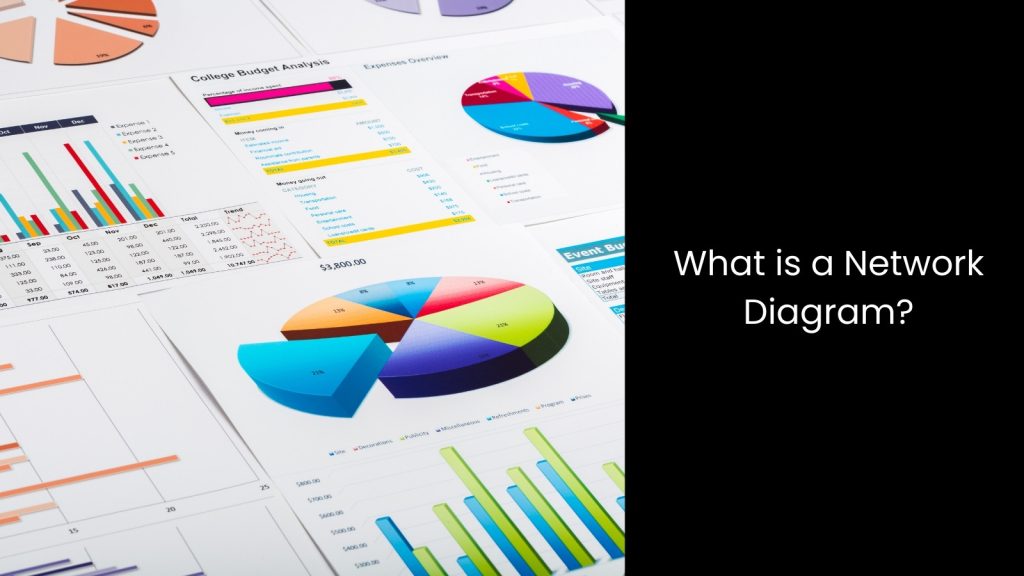
- A network diagram, as a part of data visualisation, shows the relationships and connections between different data points or elements in a visual format.
- It uses nodes, which represent individual points or objects, and edges, which are the lines connecting these nodes, to show how they are related. This type of diagram is especially useful for displaying complex systems, like social networks, computer networks, or even project workflows, where multiple elements are connected in various ways.
- When using a network diagram, people can easily see how different parts of a system interact, making it easier to understand how everything fits together. In project management, for example, a network diagram helps track tasks, dependencies, and timelines, making it easier to manage resources and ensure that the project stays on schedule.
- Apart from that, it helps visualise how different devices or servers are connected, which is crucial for monitoring system health and troubleshooting problems. One of the biggest advantages of network diagrams is their ability to simplify complex relationships by turning them into visual representations, which allows people to spot patterns, bottlenecks, or inefficiencies at a glance.
Key Benefits of Network Diagrams for Data Visualisation
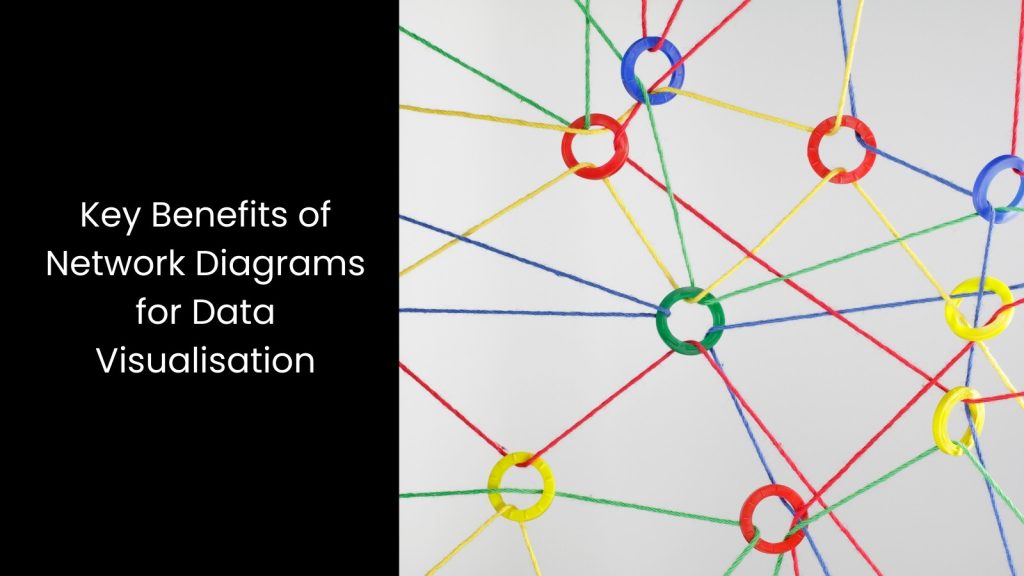
Providing Customisable Views
It is truly beneficial that this provides customisable views that allow users to focus on the most relevant information for their specific needs. This flexibility makes it easier for different stakeholders to understand the data based on their priorities. For example, in a complex system, one team might need to focus on performance metrics, while another might need to look at connection strength or relationships between different nodes.
With a network diagram, users can tailor the visualisation to highlight key metrics or specific layers of data, ensuring that everyone gets the information they need. They can be tailored to specific needs, focusing on key metrics or layers of data to suit different stakeholders’ perspectives. This means that whether you are managing a project, tracking a computer network, or analysing a communication network, the diagram can be adjusted to display the data that matters most to you. This customizability enhances decision-making because it gives users a clear and focused view of the important details, cutting out unnecessary information that could confuse them.
This makes managing complex projects or systems much more efficient and effective.
Enhancing Data Presentation
The latter makes complex information easier to understand and more engaging to present.
These diagrams visually show the relationships and connections between different data points, helping users grasp key insights at a glance. During meetings or presentations, network diagrams allow project teams to communicate complex data to both technical and non-technical audiences in a way that everyone can understand.
Instead of relying on dense tables or lengthy reports, these diagrams simplify the data and provide a clear visual summary, which speeds up the decision-making process. These diagrams make data more engaging and easier to present during meetings, establishing a better understanding across technical and non-technical audiences.
As it uses nodes and edges to represent data points and their connections, a network diagram creates a visual map that makes patterns, trends, or problems obvious to everyone involved. This helps create more productive discussions and ensures that all stakeholders are on the same page, regardless of their technical expertise.
Last but not least, the latter also allows for real-time updates, meaning the data presentation can evolve dynamically as new information becomes available. This keeps the presentation fresh and relevant, which is especially useful for ongoing projects or live data monitoring.
Easy Problem Identification
They provide a clear and organised view of how different parts of a system are connected, allowing users to quickly spot any inefficiencies, errors, or vulnerabilities. When a project or system has multiple elements interacting, it is easy for issues to go unnoticed if they are buried in complex data.
However, with a network diagram, these problems become visible because the visual format highlights areas where things may not be working as expected. They highlight inefficiencies, errors, or vulnerabilities within a system, allowing quick detection and resolution of issues.
For example, if a task in a project is delayed or a computer in a network is malfunctioning, the diagram will clearly show where the breakdown is happening by illustrating the impacted connections. This allows teams to focus their attention on the exact problem areas, saving time and reducing the risk of larger failures down the line.
Clear Relationship Mapping
The latter visualises connections between data points, making it easy to understand relationships, dependencies, and hierarchies within a system. For example, in project management, a network diagram can show which tasks depend on others, helping teams prioritise their work and ensure everything flows smoothly.
This visual representation helps teams quickly grasp key insights about how each part fits into the bigger picture. It also makes it easier to identify which elements are most critical to the overall function of the system. Furthermore, network diagrams allow users to explore hierarchies within the data.
This means that they can see which data points or tasks are at the top, controlling others, and which are at the bottom, depending on higher levels. This helps with resource allocation and planning because it shows which parts need the most attention.
Apart from this, by mapping these relationships clearly, network diagrams make communication between team members more efficient. Everyone can see the same visual representation, reducing misunderstandings or confusion about how different parts of the system relate to each other.
Simplifying Development Projects with the Use of Network Diagram Visualisation

It is 100% evident that network diagram visualisation has the ability to transform development projects with its capacity to clarify relationships, enhance communication, and make problem identification straightforward. If your enterprise encounters data visualisation challenges, the best thing you can do is purchase a software solution with advanced data visualisation features, like network diagrams, to elevate your project planning and ensure smooth execution from start to finish. A reputed supplier will solve all your data representation matters.